The process of redesigning how AI job interview results were consumed by businesses


I joined Curious Thing in 2019, 6 months after it was founded, when the company’s mission was to enable hiring managers to interview high volumes of candidates for a job in one go.
Curious Thing’s AI Job Interviewer would hold screening interviews with applicants in order to assess every candidate and remove bias. Following AI screening, hiring managers could log into a client portal where the candidates would be ranked and assessed using the latest behaviour assessment criteria, focussing on meritocracy from technical to soft skills.
Key roles: UX and UI design for the client portal, conversation UX design, creating the CT components library, brand identity, website design and commercial assets.

Customer Success passed on feedback to me that clients were exporting candidate interview data and analysing it outside the platform. Curious Thing’s goal was to automate the job candidate process from initial screening to shortlisting. This feedback signalled a lack of value in the shortlisting step. 🚩
Project responsibility: Investigate the problem, improve the experience of the candidate report and results pages (UX/UI), create new user personas and oversee implementation.
The Team: I worked with the Customer Success team manager lead, the head of sales, a data scientist and a full stack engineer.
To understand the problem better I held feedback sessions directly with the clients over Zoom (it was the middle of Covid lockdowns). These sessions were to see clients’ processes live, and to gather context regarding what they were doing with their data outside the platform.
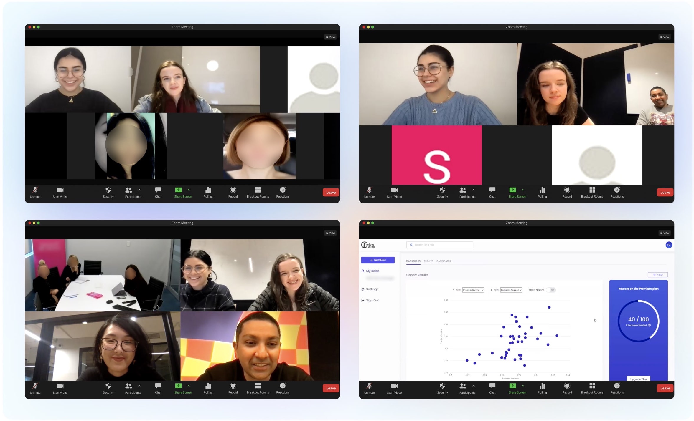
Our clients shared similar pain points and analysed the data post-interview in similar ways.
Following these sessions I presented two problems to our internal stakeholders. I was conscious to stick to the problem and not jump to the solutions proposed/used by our clients at this stage.
• Users have difficulty understanding results & analytics and interpreting them as they relate to the job role.
• Users have to leave the platform to analyse results or create shortlists.
• Users required knowledge of external tools like Excel or Tableau to analyse results.
• Users want information to be displayed as simply as possible so that anyone can immediately understand what is happening.
• Users want to be guided on how to interpret personality insights, needs, values and attribute scores as they relate to the role.
• Users want to view and sort cohort results by weighted averages based on inputs.
• Users want to see top performers for each attribute (e.g. top 25%)
• Guidance or suggestions for weightings based on role requirements.
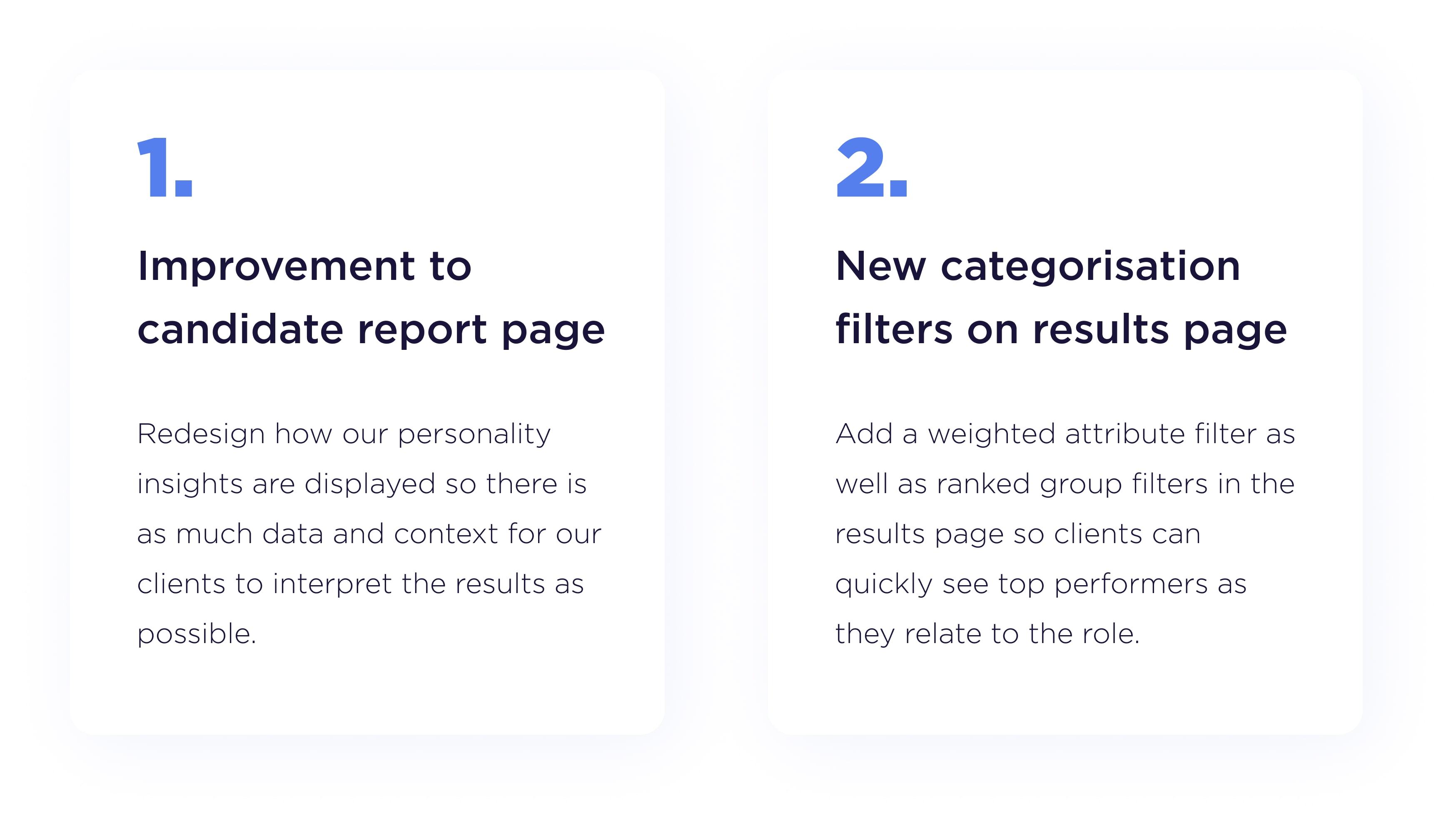
The problems could be tackled with two main areas of improvement:
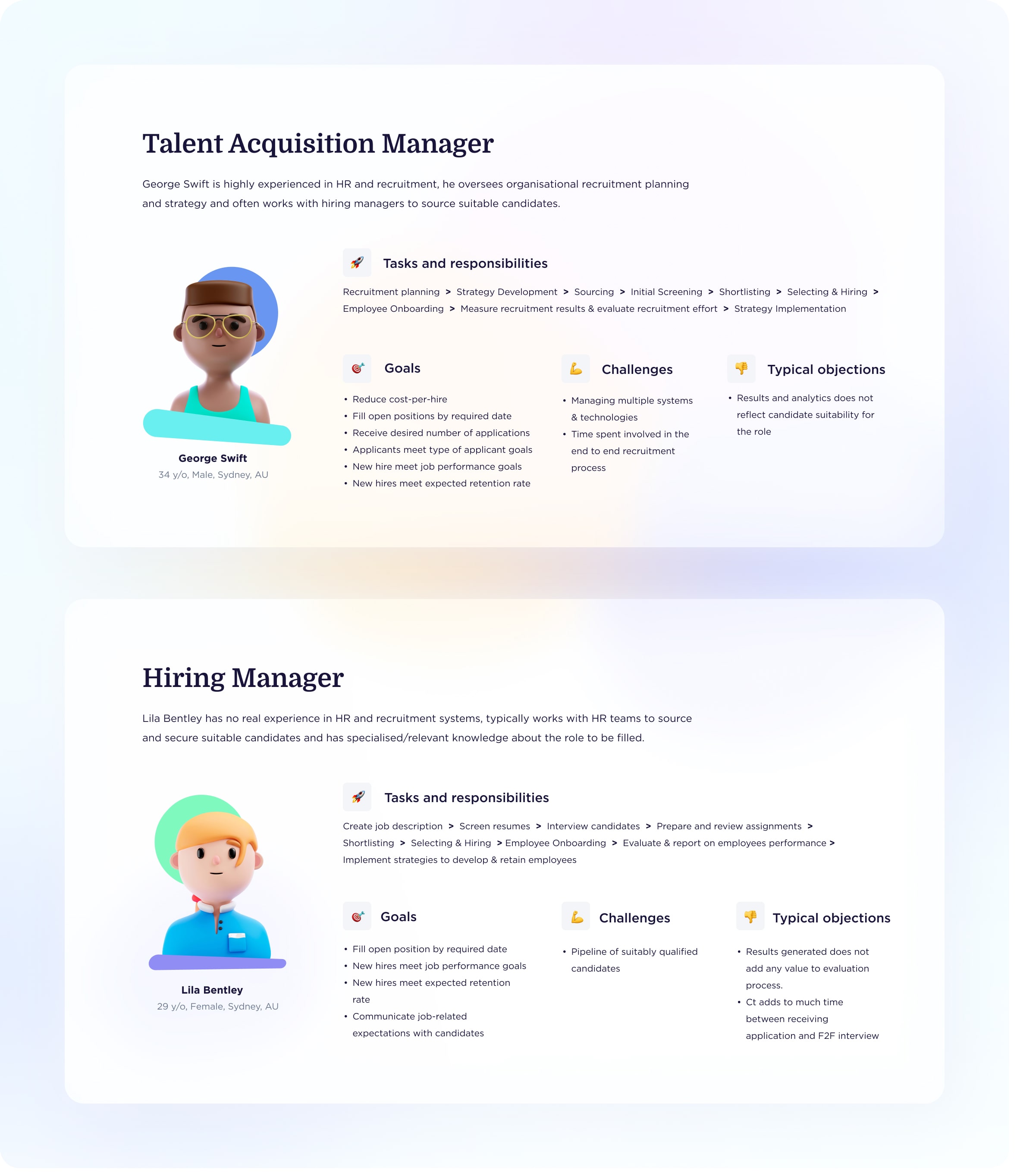
An additional benefit of the feedback sessions was enabling me realise our existing user personas were not aligned with how clients used the dashboard. I created two new key personas that were helpful references when I was later updating the UX of the results and candidate outcome page.
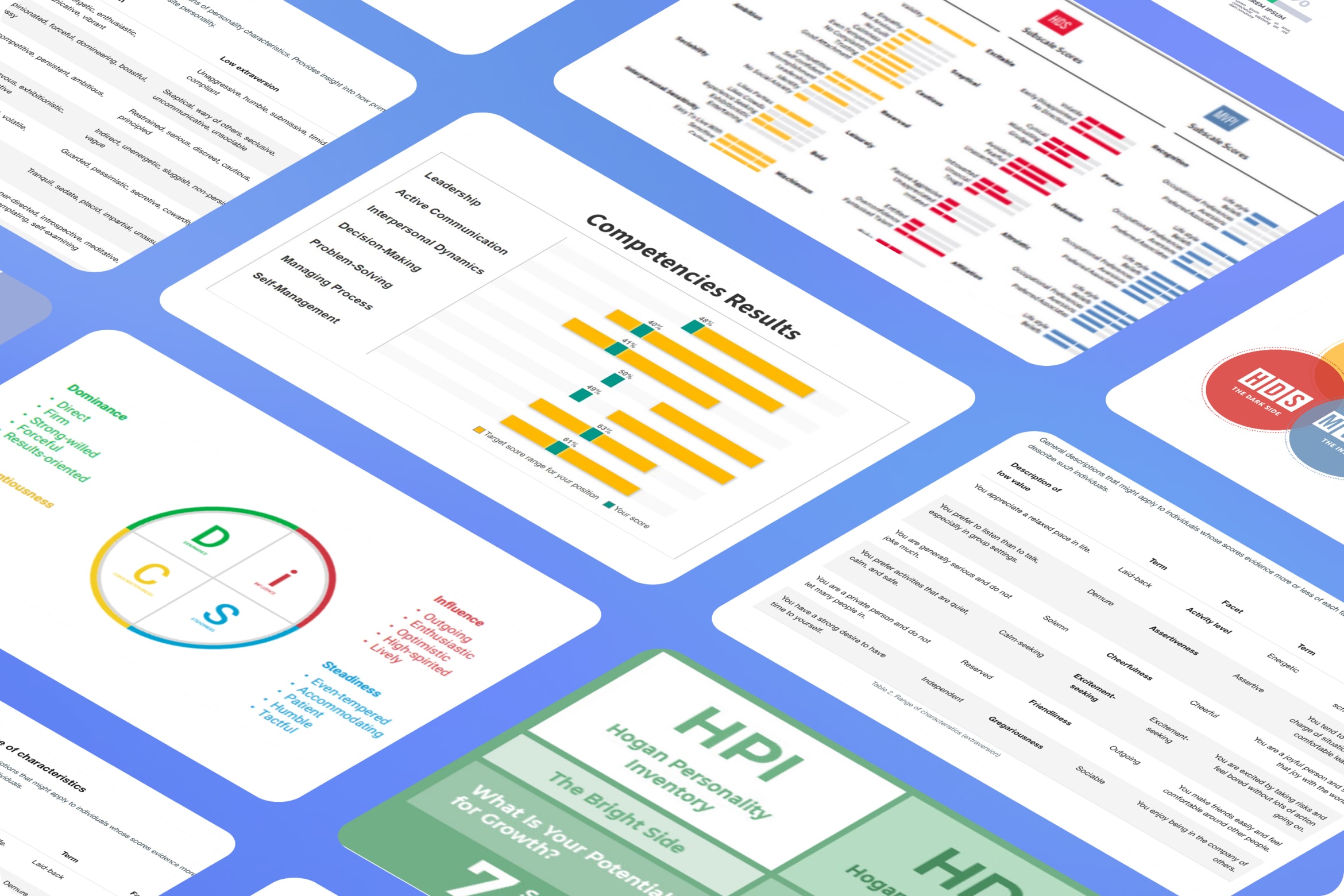
I set out asking myself two main questions. What is the most consumable way to display personality test results to clients and what is the most impactful method of displaying top candidates?
Our platform already analysed candidates using a version of the IBM Watson Big 5 personality traits. However, I wanted to make sure there wasn’t another personality test that would better suit our clients, so I also researched the DiSC Assessment, Hogan Personality Inventory and Caliber Profile.
After discussions with our data scientist on how our current assessment system was implemented, going with a different test was not worth the effort, they didn’t offer any substantial benefits. The Big 5 still suited our needs best, but needed improvement.
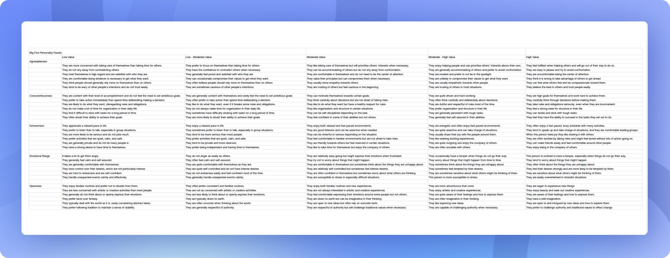
Through my research, I discovered there was also considerably more categorisation description data available that we weren’t displaying. Our labels weren’t accurate and up to date with the latest version of IMB Watson and we were using language that suggested some traits were better/worse than others.
The client feedback sessions proved to be excellent research and information gathering on what clients were already doing outside of the platform and how our own results page could be enabling users to rank candidates.
After exporting the csv data from our platform, multiple clients would use systems such as Tableau and Excel to select the top three to five attributes they wanted to asses the candidates with, and then give weightings to the attributes that were more or less important to them. This weighting had to add up to 100 and delivered a weighted average score (WAS) that could be used to rank and group the candidates.
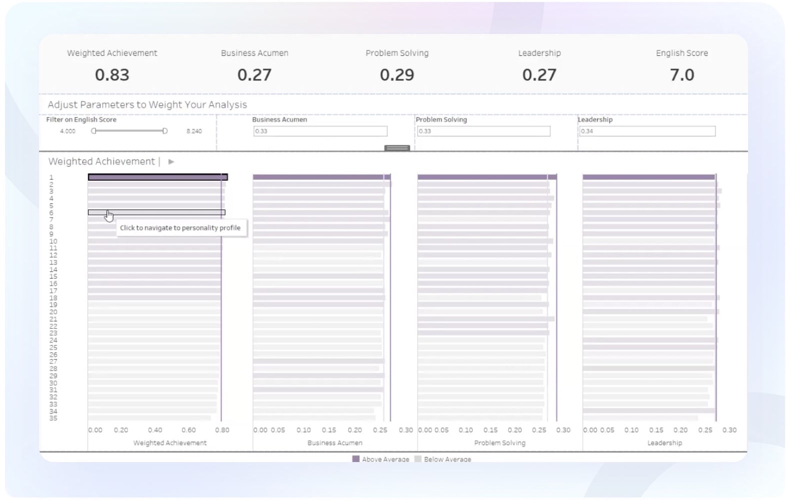
Next I conducted multiple rounds of white board sessions with our customer success lead to map out how we might present the personality insights data in a more useful way. I referenced the personas I had made earlier to help me better empathise with the user.
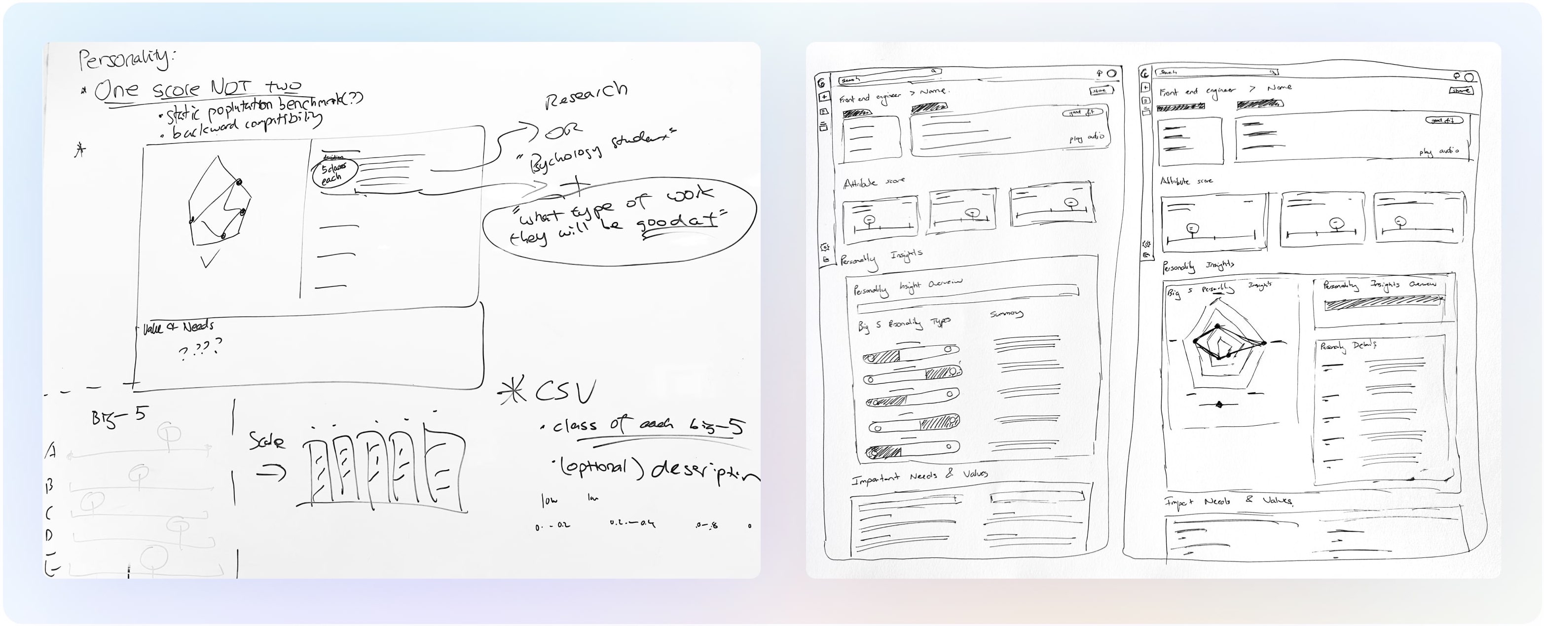
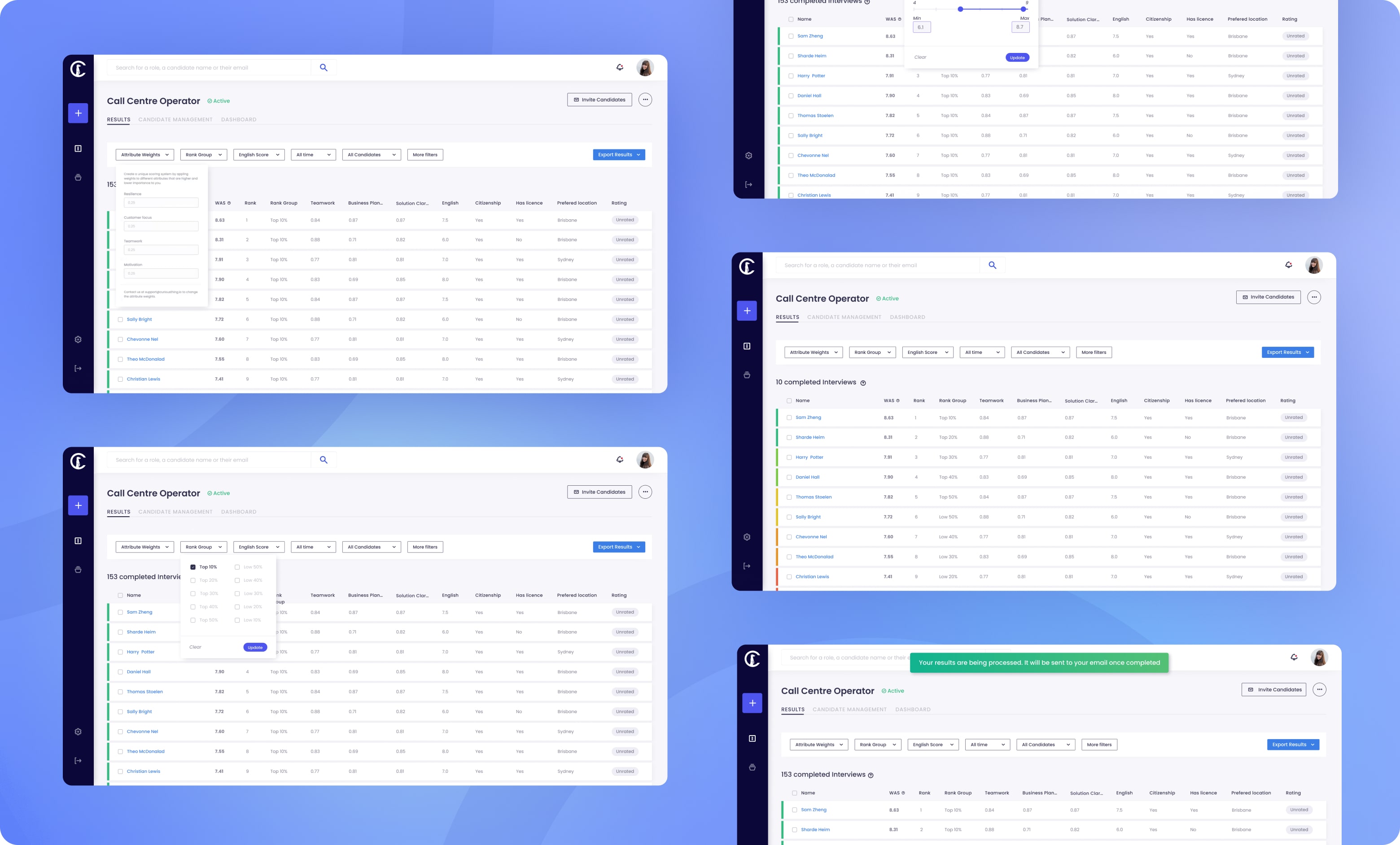
I then started paper sketching some mockups. I wanted to create a weighted attribute filtering system that was quick and easy to implement and sat at the top of the results page as part of the filter. I also wanted to introduce rank groups to visually group candidates together. e.g top 25%, top 5%.
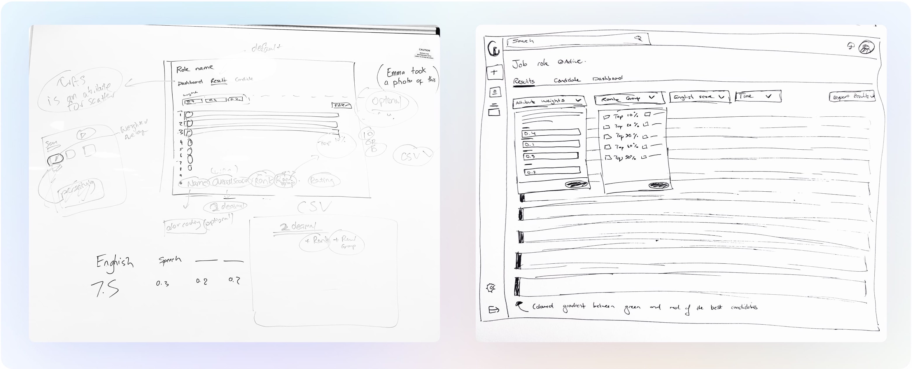
I conducted testing sessions with each of our customer success team members and our data scientist, taking them through the paper prototypes before I started the detailed UI.
There were two main streams of feedback:
1. The Big 5 personality traits were still being presented with language that implied positivity and negativity. This led to a separate work stream where the CS team lead and I re-wrote each description associated with each Big 5 personality trait using more neutral terminology.
2. The way I had designed the weighted attributes assumed users could select more or less attributes at any time during the campaign. Through testing with our data scientist I found that a limitation of our platform was that attributes could only be pre-determined at campaign set up by the internal team, and not altered once the campaign was launched. This meant the filter would become more of a reminder for users to see what attributes and weights they had selected, rather than being able to update it in real time.
Using our UI Components Library not only meant design could come together quickly, but development as well. One of my main roles at CT was creating the first version of the component library, which I worked closely with our front end engineer to implement.
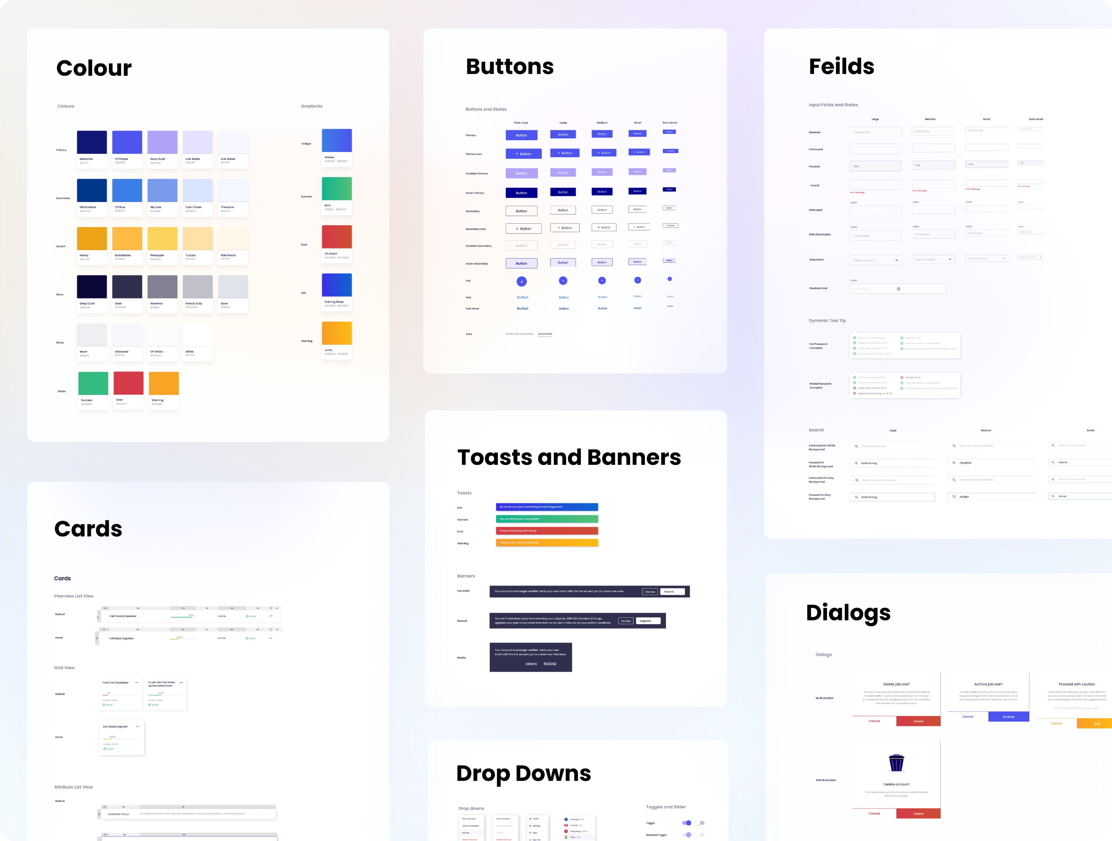
Leveraging the UI Components Library allowed the high-fidelity designs to come together quickly. Depending on the size of the design project, I normally bypass low fidelity digital design: I find that using a well functioning components library gets you 90% of the way there and it actually takes longer to simplify the designs. I built the UI in Sketch, the final results are below.
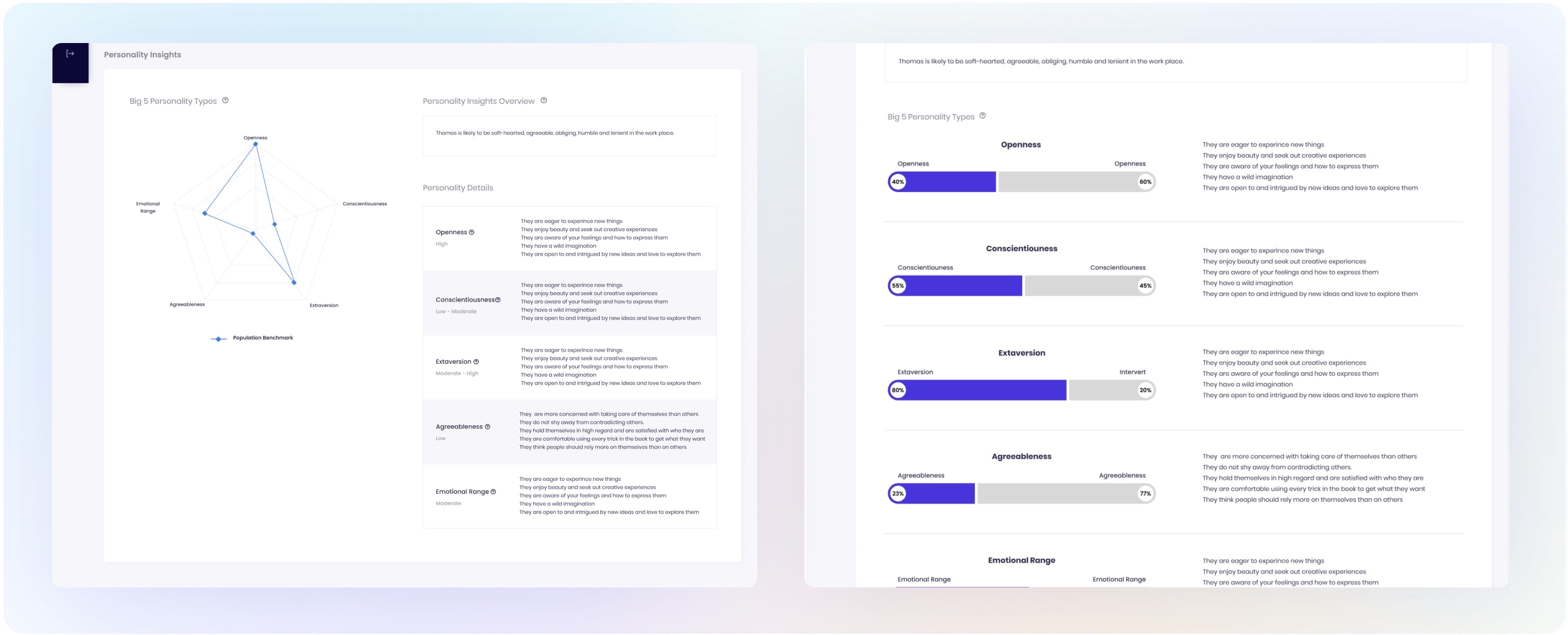
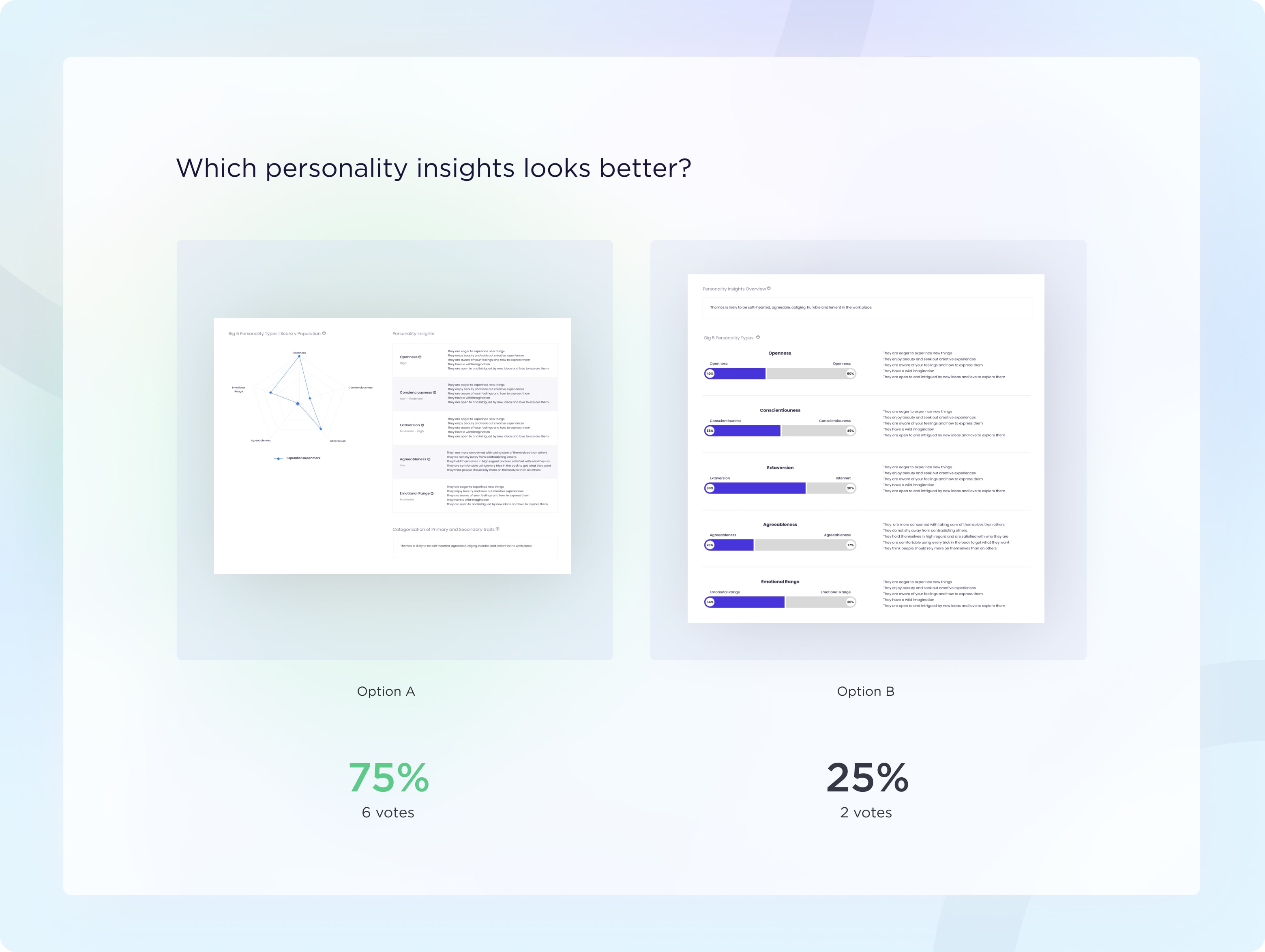
I gathered both general feedback and more pointed feedback from clients and Customer Success on whether design A or B was the more neutral presentation of the Big 5 personality traits.
Their general feedback was extremely positive, and the overall vote was for design A.
I pride myself on the design to developer handover as I once was a front end engineer. I put together a product document for engineering outlining the problem and solution, the business ‘why’, the list of new features, the requirements, metric rules and the before and after UI.
To deliver immediate value to our clients, the feature was split into two stages, personality improvements first then improvements to the results page.
Once each round of implementation was done, it was my job to undertake UAT testing and functional and design sign off before the feature was released. During my UAT testing, I put together a sheet with all of my feedback prioritised by low, medium, high and urgent fixes before the feature was to be released.
Implementation of both features took about a sprint (2 weeks) worth of work.
After both features were implemented, we received a lot of positive feedback from clients and Customer Success. The weighted attributes and ranked group filters were definitely fan favourites. My key takeaways were:
We already had the functionality implemented, but not in a way that enabled our clients to easily access the information they wanted. In the end, we didn't’ need an entire redesign, just some tweaks to bring out this value.
While I don’t often like to consider the bandaid fixes clients use to solve their problems, in this instance their workaround was quite smart and sophisticated and was easy to implement in our existing system.
My original design assumed our system would work a certain way technically, when in fact our system had some HARD limitations. Being flexible and adaptable with my designs to work within the current technical system limitations is always crucial.
