The process of redesigning the analytics page for a digital AI Voice Assistant


In late 2021, Curious Thing went through a substantial product pivot — from an
AI Recruitment Software product to a mass knowledge discovery and data gathering B2B platform. During early 2022, CT’s voice AI assistant contacted over 150,000 covid-affected businesses in one week to identify where human assistance was needed.
Key roles: Leading product design for the client portal and internal campaign builder, owning the entire design roadmap, contributing to the broader product roadmap, managing junior design team members, and making the final design decisions on branding, style, website etc.
Sitting within the client portal web-app, the analytics page gives customers an in-depth visualisation of the progress of their campaign. The main users of this page were a handful of clients (campaign managers), but predominantly CT’s customer success team.
Project responsibility: I was responsible for the analytics page redesign from its initial conception, design (UX and UI), to overseeing its implementation.
The Team: I worked with a front-end and a back-end engineer to bring this to life, a junior UI designer and the customer success team manager.
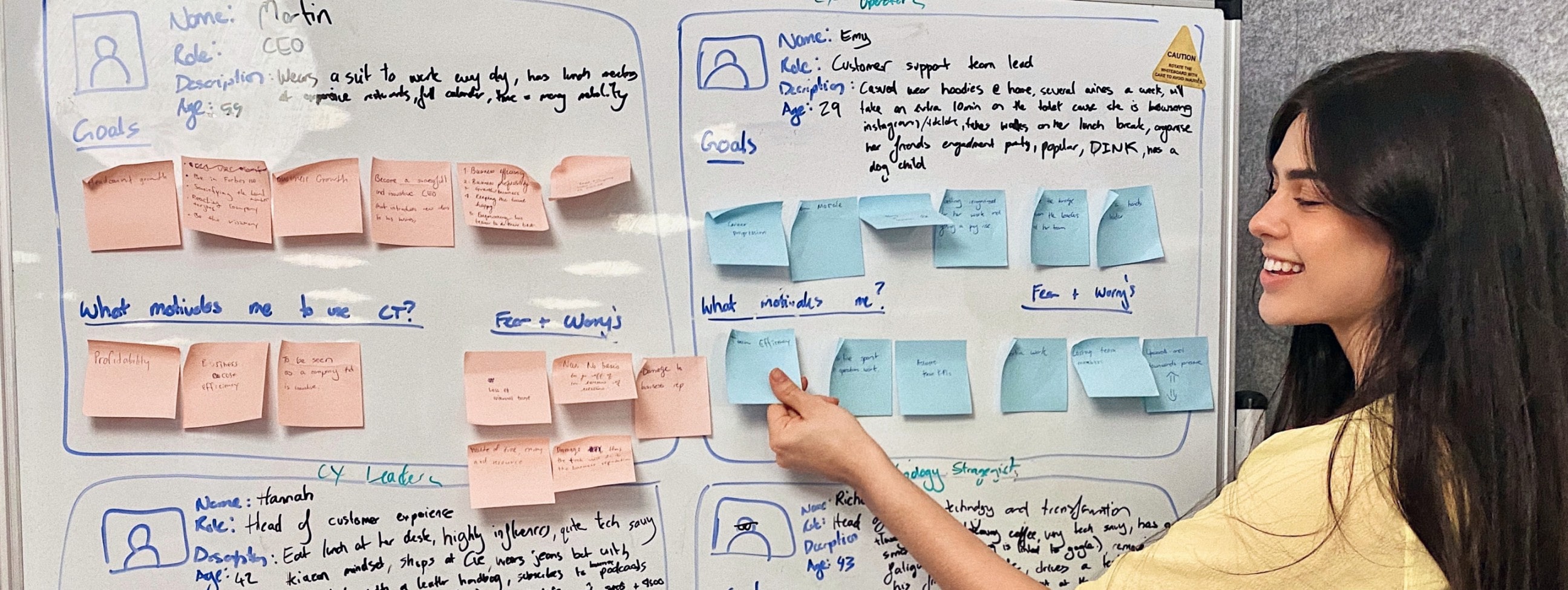
At the time, we had no internal tooling to indicate client usage within the platform. To work around this, I was conducting weekly interviews and feedback sessions with our external clients and internal customer success team to see and hear first hand how they were using our product.
• Interested in more qualitative data (what people are saying)
• Unsure how to extract useful data from the analytics page, quite overwhelming
• Mainly using the overview page for insights, not the analytics page
• Would often screenshot the analytics page to share progress with their higher-ups
• CS spending 5+hrs/client/week extracting data from the overview, analytics and results pages, analysing it and presenting it to the clients via powerpoint.
• Each powerpoint had to be customised to each clients’ definition of success.
• Current conversation flow was not visible to the client.
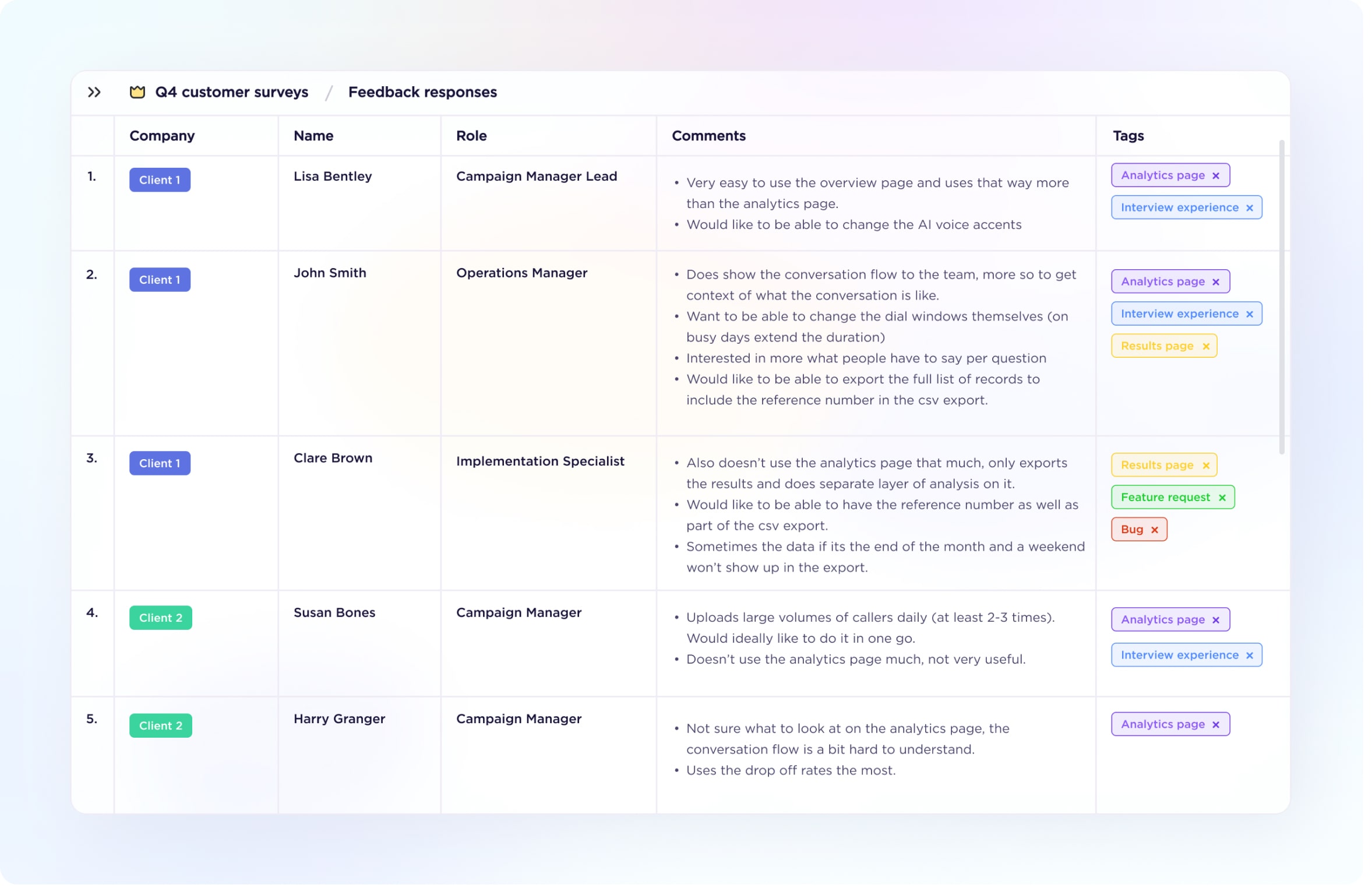
The feedback was simple: our analytics page was not useful. Our CS team was using bandaids as temporary fixes.
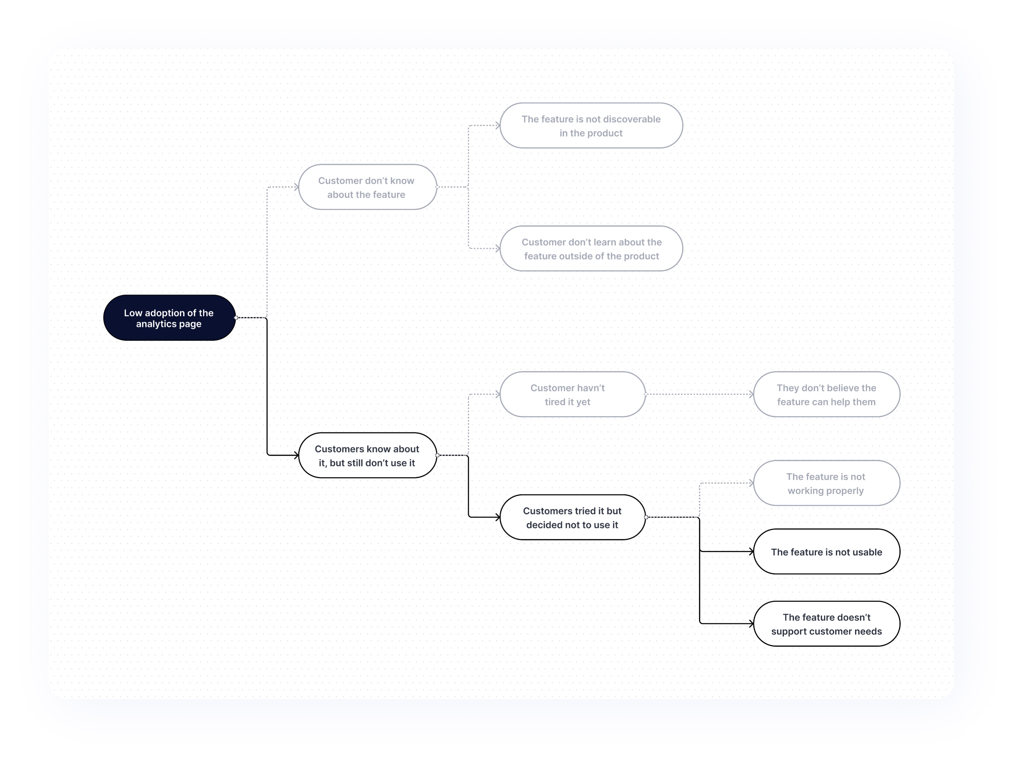
I needed a clear problem statement to ensure we would tackle the heart of the problem and develop an actual value-adding solution. To get this, I started with a MECE (Mutually Exclusive Collectively Exhaustive) Issue Tree to help me find the most important part of the problem and focus on it.
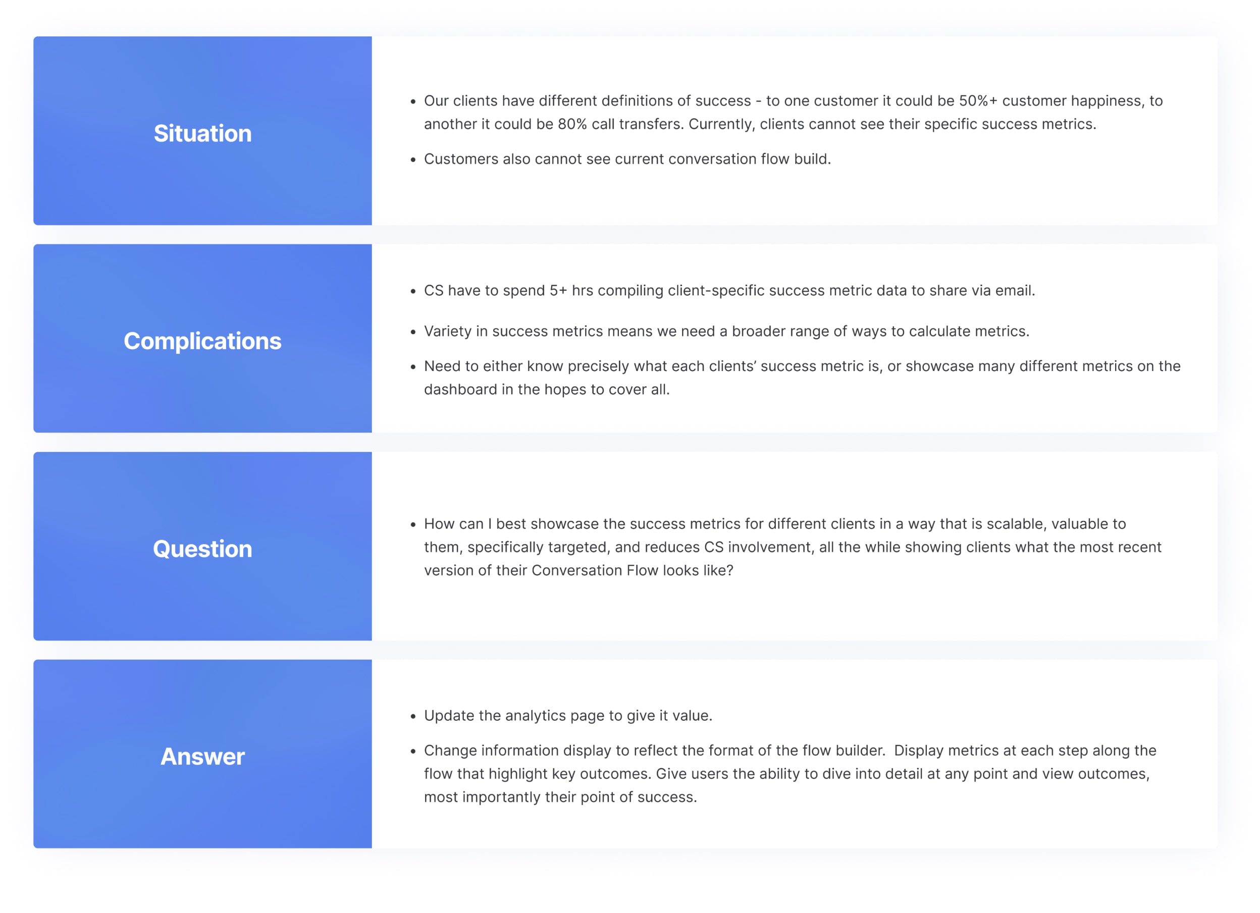
Then, I developed a SCQA Problem Statement to share with the team and stakeholders.
I added the problem to our ideas column in the product roadmap for discussion with the CTO, CEO and Head of Solution.
How confident was I that this improvement would make enough impact to be worth the effort?
I wanted to gauge engineering effort and gather a few more requirements before the next product meeting.
Based on two requirement gather meetings with our CS lead and lead engineer, I created a requirements document outlining the two main streams of improvement:
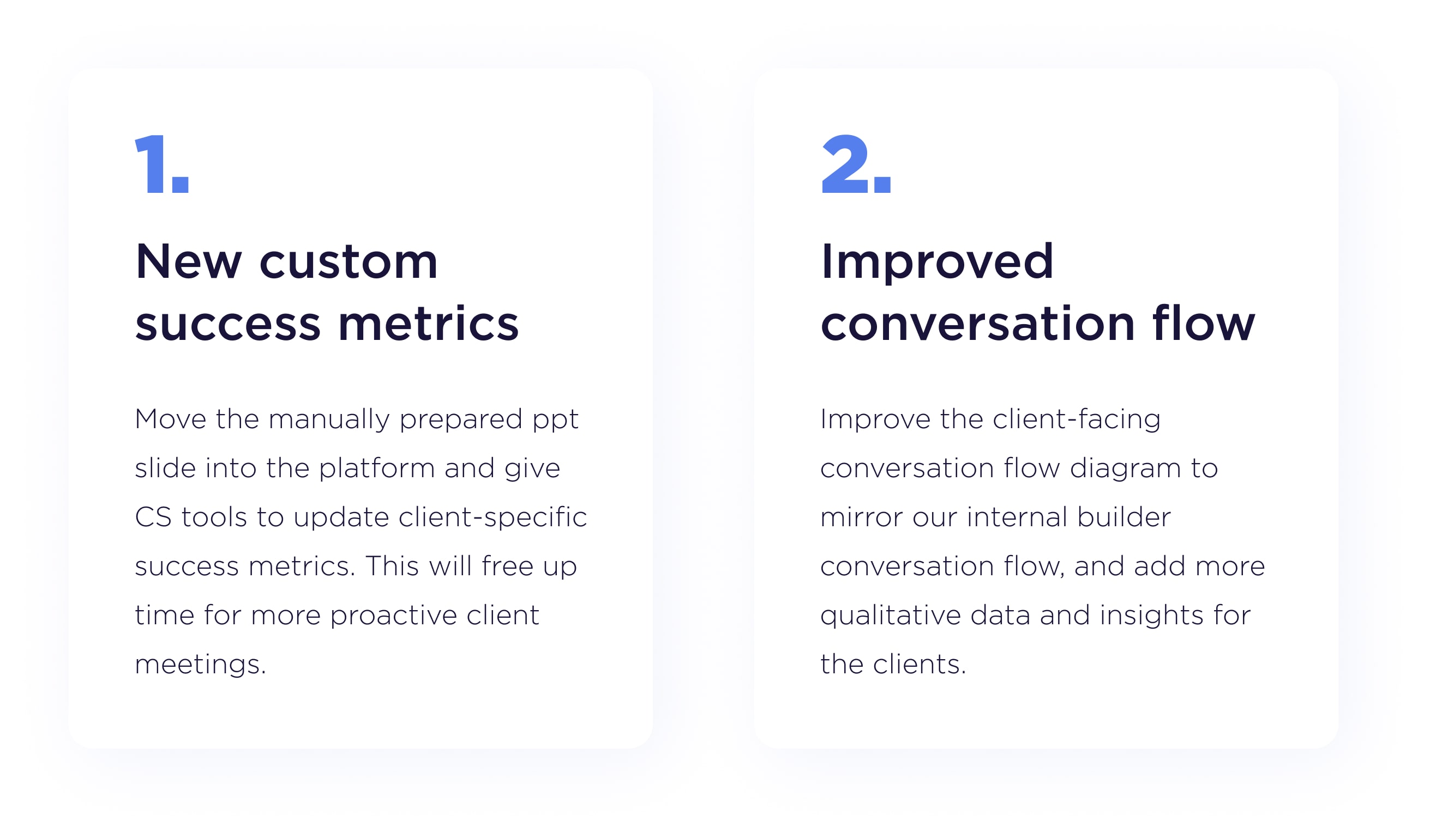
I then used the RICE (Reach, Impact, Confidence, and Effort) scoring model as a cost-benefit analysis to help contextualise whether this particular feature was worth pursuing:

I shared both the requirements doc and RICE estimate with the product stakeholders and it was given the go ahead. This feature was medium urgency, so design would get designs ready for engineering to more accurately estimate effort, which would then be separately staged.
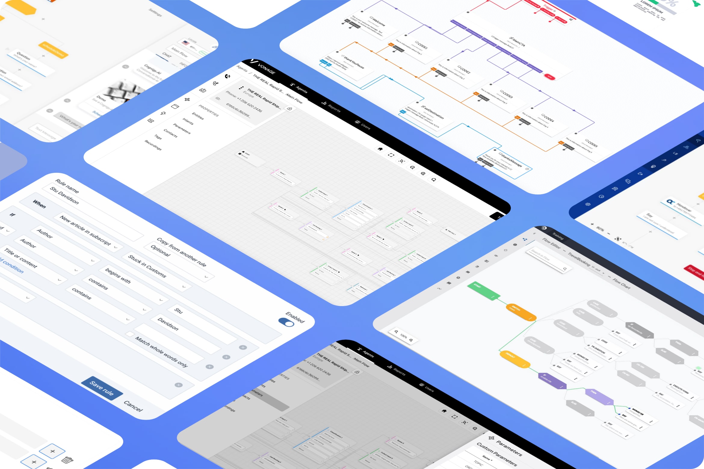
A Junior UI designer and I started the research process by creating three competitor analysis breakdowns, looking at how they showcased qualitative data, what insights they showed, and looking for visual appeal.
For inspiration, we looked at Cognigy, Voyage AI Studio and Twillio Studio, all players in the Voice AI space.
Researching complex filtering systems gave me an idea how we would could display different success metrics for our clients. Most of them used a system of IF and ELSE statements to create conditions that had to be met to display the data.
What if we could do something along those lines but for the custom success metrics? And not just IF and ELSE statements but also OR and AND, to cover every possible path a customer could go down.
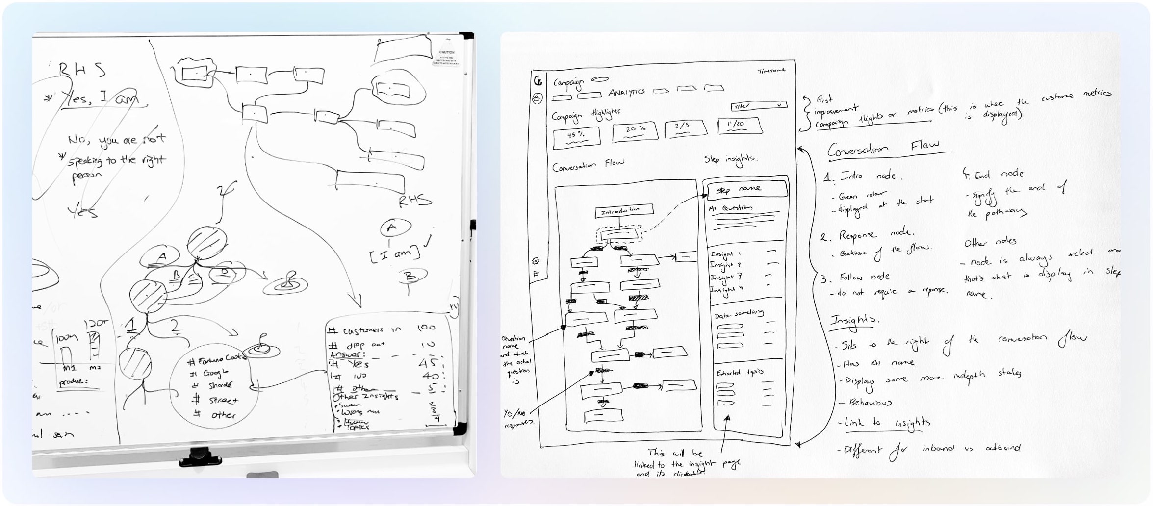
Next, I started the process of wire framing what the user journey and rough UI would look like. After multiple white board sessions, I started paper sketching some mockups. Mapping out the user experience outline by hand is always my first step towards anything visual.
The first few versions of the flow diagram conceptualised the conversation flow cascading down instead of side to side — and when a user clicked into each question, it would open up a panel showing further data on the side.
I originally had the custom success metrics displayed at the top of the analytics page but created by CS within our campaign builder tool (this changed after testing). The creation of custom metrics was a series of powerful, targeted filters that would set up the condition of a metric.
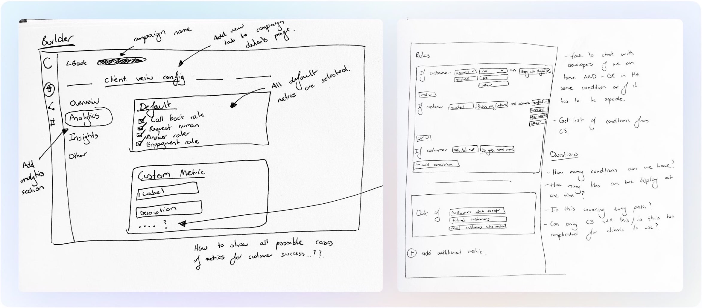
I conducted testing sessions with each of our customer success team members (3 in total), taking them through the paper prototypes before I started the detailed UI.
Their main feedback was that creation of custom metrics didn’t belong in the campaign builder tool but rather in the actual analytics page. It would be easier for CS to create the metric cards on the analytics page (which they were already on) without having to jump between two separate platforms. This meant we needed a separate view for CS and for clients.
Using our UI Components Library not only meant design could come together quickly, but development as well. I had prepared the first version of our library for the previous AI Job Interviewer product, and with the help of my junior, it evolved to what you see below.
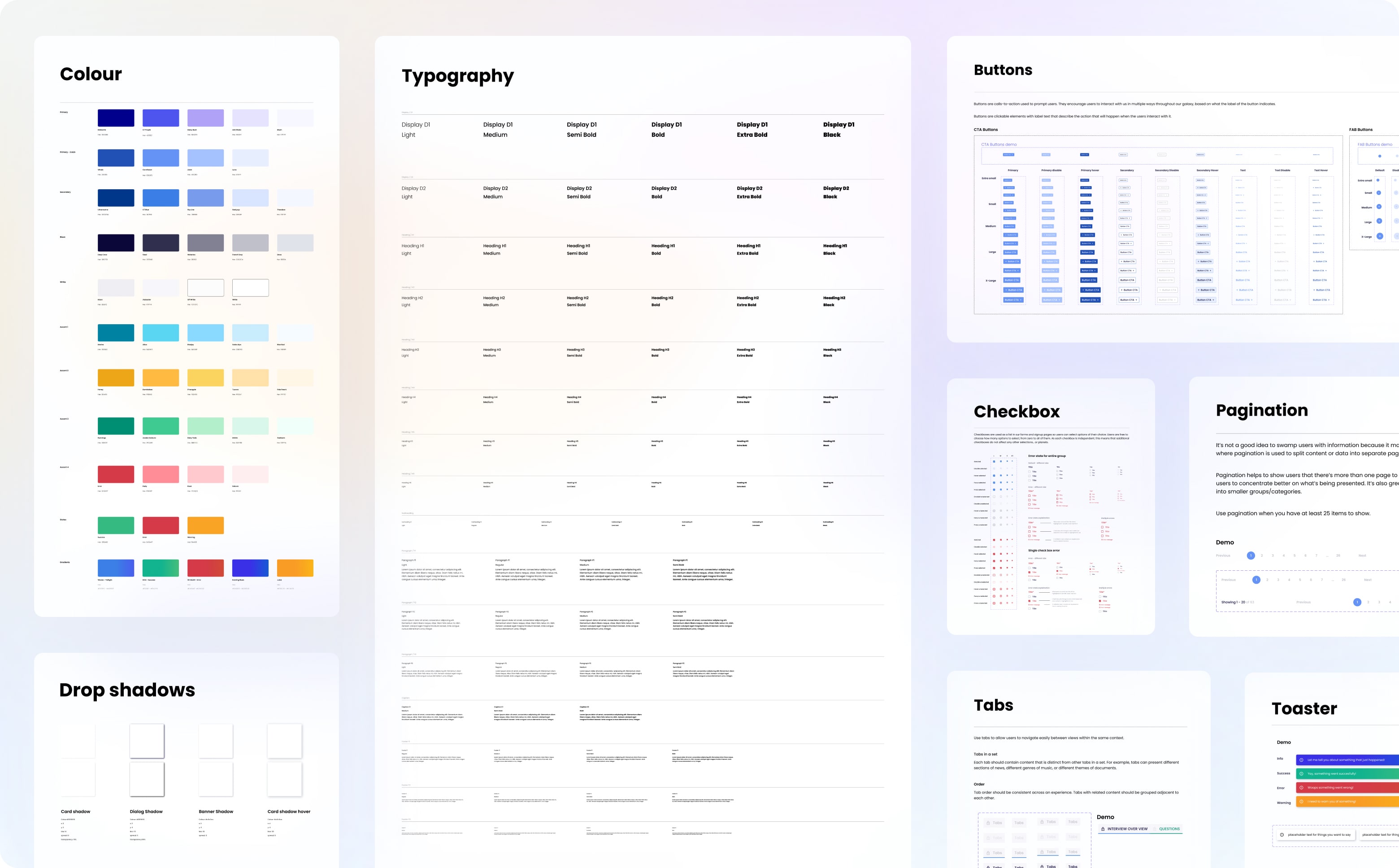
Leveraging the UI Components Library allowed the high-fidelity designs to come together quickly. Depending on the size of the design project, I normally bypass low fidelity digital design: I find that using a well functioning components library gets you 90% of the way there and it actually takes longer to simplify the designs.
Building and prototyping in Figma meant better testing and handover with clients and developers. The final result is below.
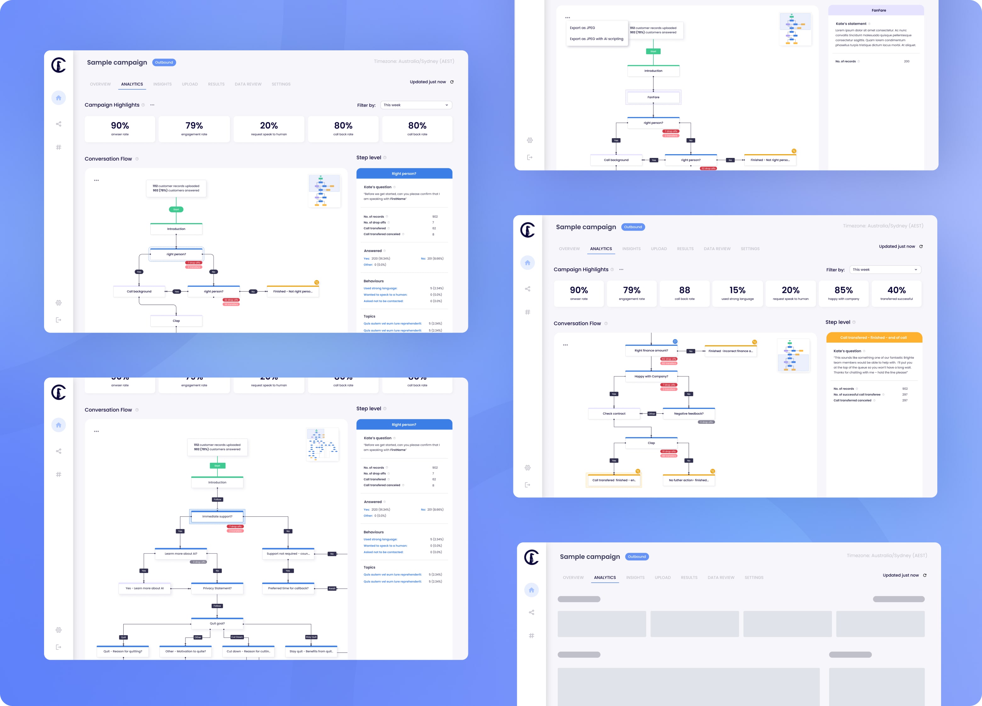
I then conducted a second round of testing with customer success as well as our clients. CS testing revealed the need for more conditions for the custom metrics as well as the ability to export the conversation flow as an image (to replace screenshotting).
Client feedback session were conducted over zoom. I took them through the prototype and they were extremely positive. The only additional feedback was the same as CS: they also wanted the ability to export the conversation flow as a image. Those updates were made.
I take pride in my design to developer handover as I once was a front end engineer. I put together a product document for engineering outlining the problem and solution, the business ‘why’, the list of new features, the requirements, metric rules and the before and after UI.
After the first reverse scoping meeting with the CTO and front-end and back-end engineers, the dev estimation for the feature was larger than originally expected, particularly to implement the conversational flow UI.
To deliver immediate value to our clients, the feature was split into two stages, first adding just the custom metrics to the analytics page but keeping the old conversation flow. This would substantially save on CS’s time and deliver immediate value for our clients. Then, conversation flow would be updated in a later round of improvements.
Once the first round of implementation was done, it was my job to undertake UAT testing and give functional and design sign off before the feature was released. During my UAT testing, I put together a sheet with all of my feedback prioritised by low, medium, high and urgent fixes before the feature was to be released.
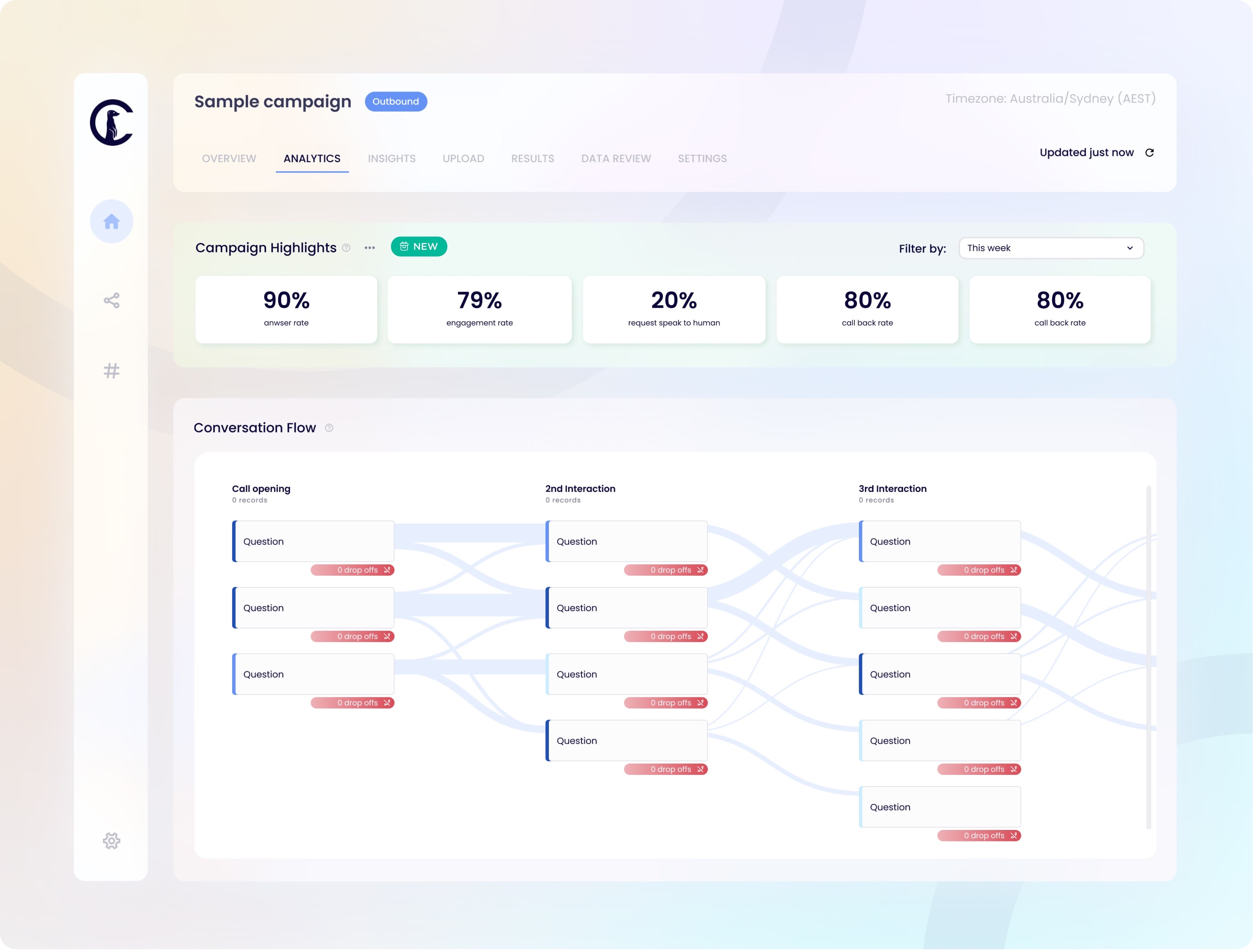
A week after phase 1 of the feature went live, I conducted a feedback session with our customer success team to monitor how they and the clients were finding it. The feedback was very positive from both sides. CS were still using the powerpoint for the time being but it was now populated with data from the analytics page so it was taking no time at all to put together. Their intention in the future through onboarding was to slowly phase out the powerpoint and instead conduct a live session with clients going over the results within the dashboard.
A follow-up improvement that came out of the session was a list of rules and definitions of what the metics meant, e.g. when we say a customer reached a step, did they finish it, start it, or just finish the previous step? This was to make sure there was no room for confusion.
It is a shame that I never go to see the second half of the feature, the new conversation flow, come into fruition, as I left CT before it was built. Seeing the custom success metrics being utilised by our team was very rewarding. Some of my main learnings from this project are:
I am very happy with how much time was spent determining the actual problem and what would add the most value for the clients/internal team. This meant we were very confident that the solution we put forward would solve the problem. I would have loved internal tooling and data to help support the findings from the verbal interviews. If I could do it over, I would push even harder to set up internal tooling.
Something that I am constantly reminded of is the importance of multiple pulse checks with your users at each stage of the design process. Little check ins make sure you don’t waste time on design that will have to be redone later.
Something I re-learnt during the problem is not to forget about help documents and breakdowns, especially if you are implementing quite a complex and powerful tool. If the entire CS team was to turn over, is there enough documentation for a new team to understand this tool?
